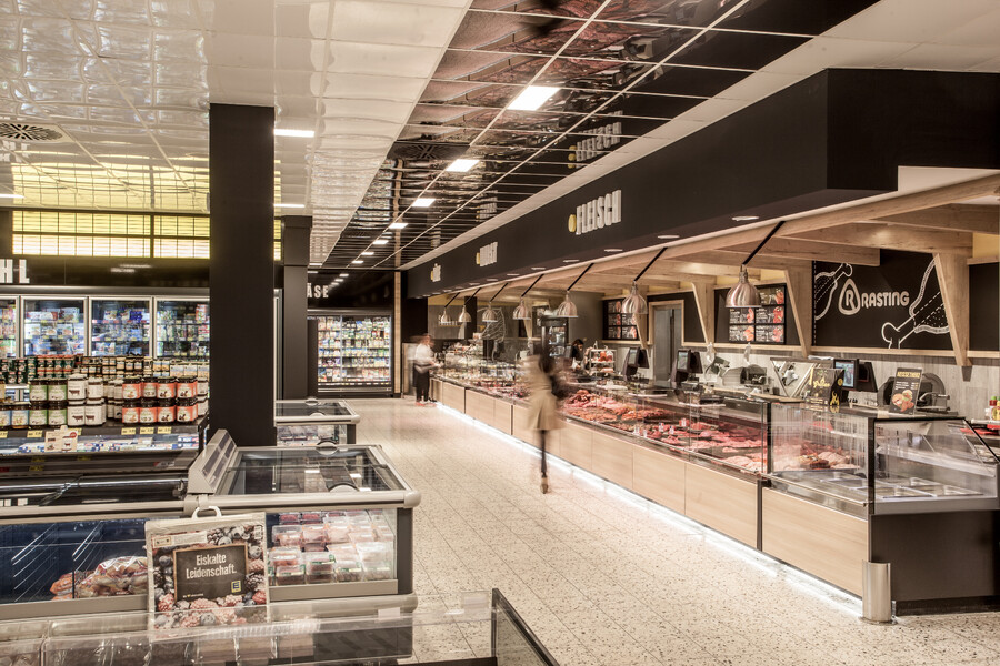
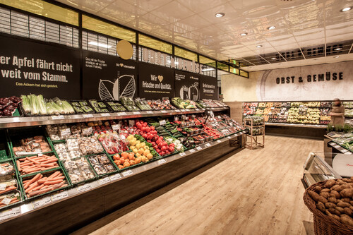
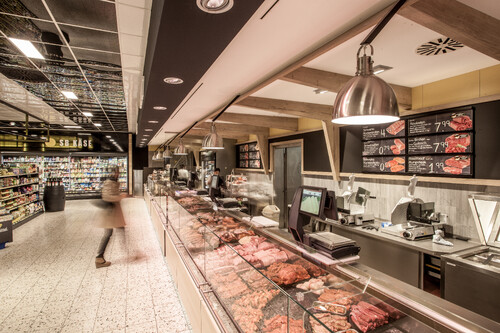
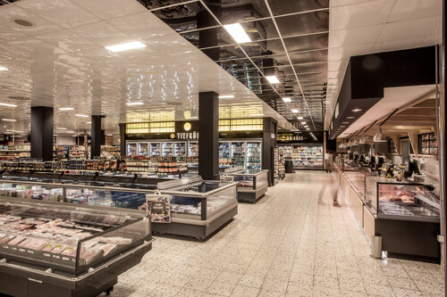
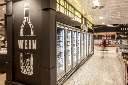
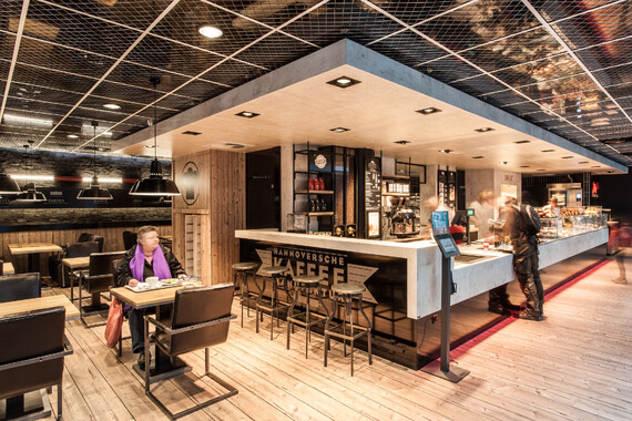
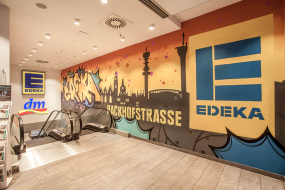
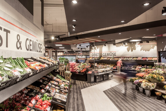
By taking over the Kaisers markets, it was necessary to introduce the former Kaisers customer to the EDEKA brand in order to win them over as a loyal EDEKA customer. A clear separation from the old Kaiser markets through the design and the creation of a contemporary, modern and pleasant shopping experience achieves this goal. With our design, we elegantly highlight the Edeka CI color. The use of the color yellow as the main color of the concept in combination with black materials supports the identification with the Edeka brand in a high-quality way and at the same time separates itself from the former Kaiser's store concept.
The aim was also to give the markets a new face and a new direction through the new design concept. What the name EDEKA stands for, the high quality of the food, should be visible to the customer. The topic of own production, fresh, regional, organic should continue to be in the foreground.
This feeling of high quality is further supported by the loft-like atmosphere. Materials such as concrete, black metal profiles, wood, glass and chalkboard underline the handcrafted, industrial character. This is complemented by the hand-drawn graphics developed for this concept. They are intended to support the handcrafted character, in the form of a construction sketch of food in the old mechanical style.
Feedback geben
Seitenleisten
