When redesigning the market in Pattensen, a small town south of Hanover, the focus was particularly on redesigning the cash register area.
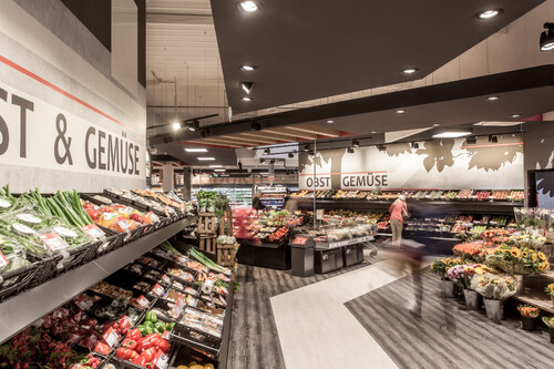
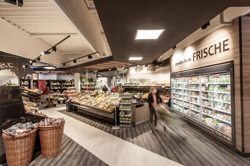
When you enter, the market opens up to the customer as a kind of marketplace.
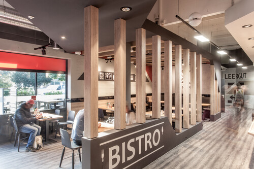
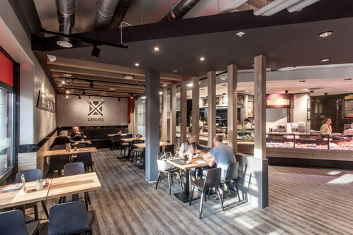
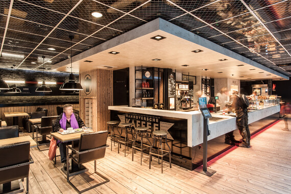
From this point you have an overview of the variety of offers such as the local post office, the bakery and the snack bar. With the open fruit and vegetable department with a generous selection of flowers and the checkout area, this is both the starting and ending point for shopping in the supermarket. In the center of the new market area there is also enough space to offer customers seasonal, local products or promotional items. The bistro area right next to the bakery with plenty of seating invites customers to linger.
The market thus becomes a social meeting place for customers.
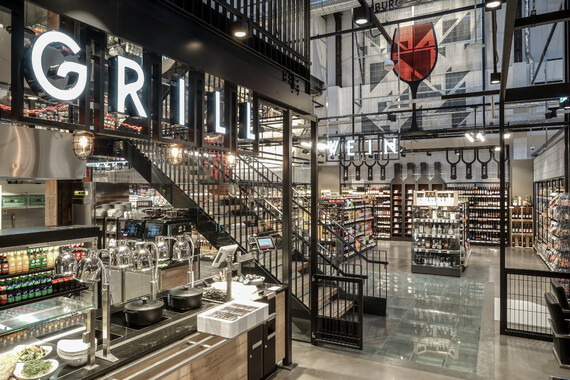
When designing the market, it was important to us to create a warm, cozy atmosphere in which you feel comfortable. This was achieved through the use of warm wooden materials. The shelf conversions and the entire floor have been designed with a wooden plank look. A subtle color scheme in black, white and concrete looks in combination with the eye-catching dark ceiling sails, which are interrupted by wooden beams, give the market a modern character.
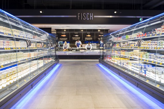
A subtle use of the color red accompanies the customer through the store and indicates Rewe's CI color. The shadowy graphics of plants in the fruit and vegetable concrete background combine the subtle modern elements with cozy, rural charm and round off the design. All customers should feel comfortable here, from young to old.

