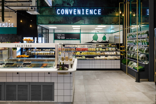
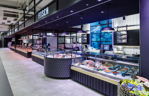
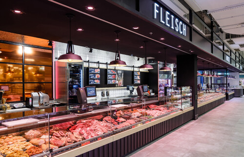
Before the renovation, the Marktkauf in Gütersloh was one of the last markets in Germany that still embodied the old Marktkauf concept with the brand colors green and yellow inside and out. This color concept ran through the entire store on the walls and in the middle room, which is why the individual departments were not clearly differentiated from one another and made orientation in the store more difficult. There was also a lack of spatial divisions that would divide the large hall into logical sections. When redesigning the market, the focus was on improving customer orientation and restructuring the space.
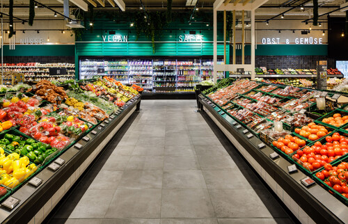
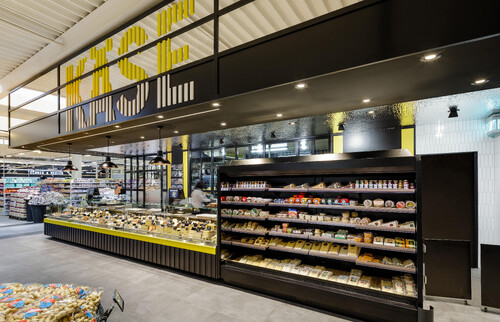
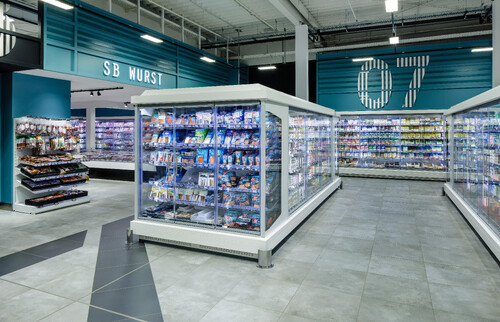
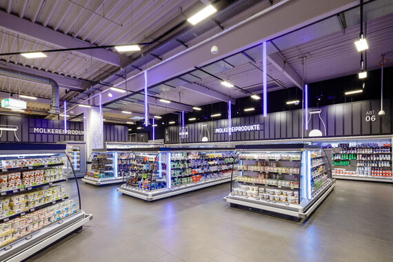
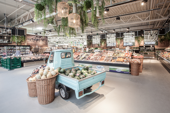
By emphasizing each product group with highlight shelves, a clear division of the departments is created. Each highlight reflects the department's range in terms of color and atmosphere. Large format numbering in a slatted look on the walls and shelves gives the departments a graphic allocation and division. In this way, the customer associates the number graphics and highlight colors directly with the departments and can find their way around the market better.
A roof made of lamella-shaped wooden elements forms above the two main aisles in the market, which literally grow out of the gondola head shelves as a room divider and then merge into the ceiling construction at a 90° angle. Shelves with plant decorations are attached to the room dividers, which almost gives the corridors the charm of a green avenue. Additionally, vertical glow sticks between the slats on the ceiling mark the main customer journey. The corridors are also highlighted in the floor by black tile strips that frame them. In this way, the customer route is clearly defined and the customer always finds his way back to the main route in the huge area of 5300m², from where he is directed to the individual departments.

