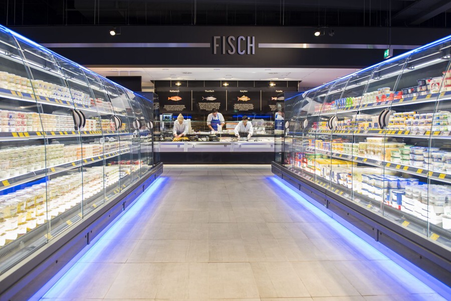
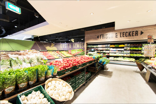
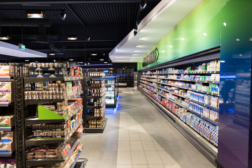
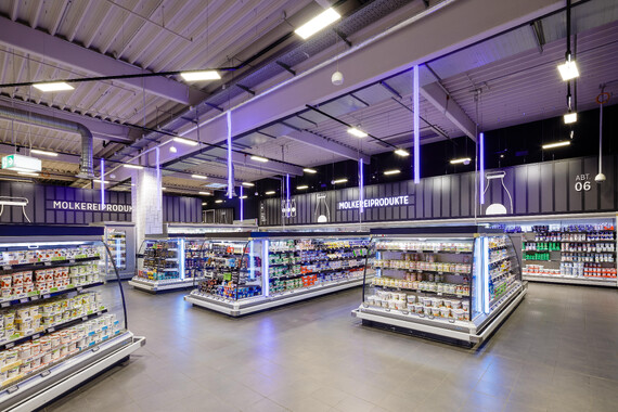
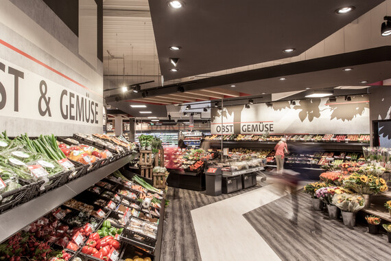
When converting the food market in Gladbeck, the conceptual focus was on creating an elegant and modern character. This is created through a clear, color-based division. The ceiling was initially painted black. The customer is guided through the market with suspended white plasterboard panels and a horizontal band on which the respective headings can be read. The customer journey is also reflected in the differentiation of the material and color of the floor. The dynamic interplay of the color contrast in the ceiling and floor leads customers into the market.
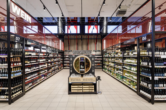
The individual departments were given accents that revisited the respective topic. The cooling area with its superstructures has a colorful, shiny gradient, the wine department has wood and the organic department is highlighted by a special design with wooden elements and green, color accents. The fresh and modern character is conveyed visually. The graphics in the freshness section make this clear. Black boards with a manufactory character are used at the service counter to describe the products in more detail and thus show their value.
The clear division of the market and the headings enable the customer to find their way around the market in a simple and understandable way.
